Breaking the Mold: Why Unconventional Website Design Works (and When It Doesn’t)

In the age of templates and uniformity, unconventional website design is a breath of fresh air. While traditional layouts prioritize usability and familiarity, a growing number of brands are turning to unexpected formats, interactions, and visual structures to stand out. But does breaking the rules actually work? And where do you draw the line between creativity and chaos?
What Is Unconventional Web Design?
Unconventional web design flips standard user expectations. Think asymmetrical layouts that guide your eyes off the typical Z-pattern, oversized type used more for mood than legibility, scroll-triggered animations that feel like storytelling, or chaotic grids inspired by brutalism. Sometimes, it’s as subtle as hiding the menu until you hover. Sometimes, it’s full-blown visual anarchy.
Design like this challenges the header-body-footer format and tries to do something else entirely—usually with emotion or experience in mind.
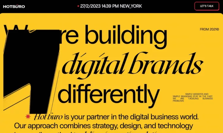
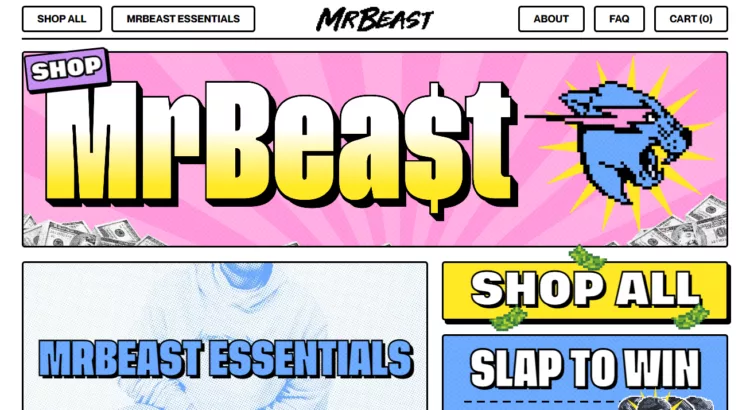
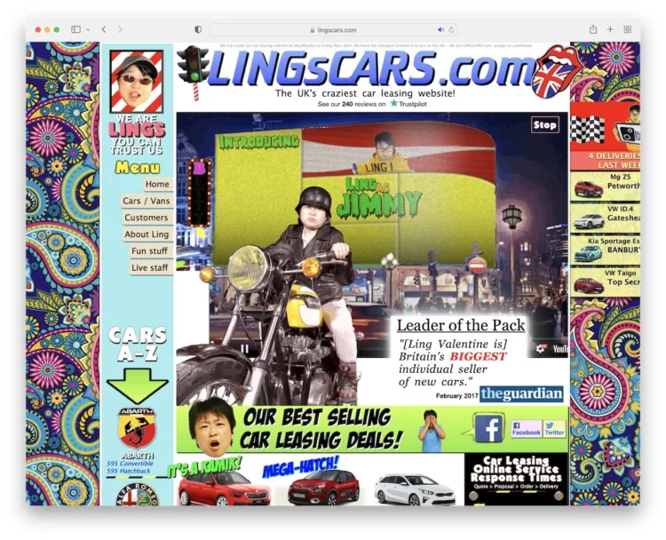
Examples worth checking out:
Why Go Off-Script?
Standing out online is getting harder. Most sites follow the same few playbooks. That’s not always a bad thing—conventions exist because they work. But for some brands, especially in the creative space, those rules are meant to be bent.
A nontraditional layout can signal to users: "We're different." That’s great if your whole business is about being original.
It also invites emotional reactions. A surprising scroll experience or an immersive visual design can stick in someone’s brain way longer than a standard grid ever could. When people feel something, they’re more likely to remember you.
And then there’s the engagement side: if your layout is interactive, playful, or even a little confusing—in a good way—users may stay longer, click more, or explore further.
But Let’s Be Honest—It’s Risky
If you’ve ever landed on a site and had no idea what to do next, you’ve seen unconventional design go wrong.
A few common traps:
- Navigation that’s too clever for its own good.
- Layouts that break on mobile or feel glitchy.
- Aesthetic overload that makes content hard to read.
- Overuse of animations or effects that slow the site down.
And then there's accessibility. Unusual layouts can be harder for screen readers to parse or for neurodiverse users to navigate comfortably. That doesn’t mean you have to play it safe, but it does mean you need to test carefully.
So When Should You Take the Leap?
If your brand lives in a creative industry—fashion, art, music, or design—your users may actually expect some creative friction. In those cases, a bold, even polarizing design can work. Also, if your goal is storytelling more than sales—like a personal project, portfolio, or interactive editorial—this is a great place to explore weirdness. But if your site needs to convert users quickly, support eCommerce, or serve a wide, non-tech-savvy audience, you might want to keep your experiments subtle. Think microinteractions, creative use of typography, or playful hover states rather than full navigational reworks.
Ways to Be Weird (Without Losing Everyone)
You can still push boundaries without sending users into panic mode. Some lower-risk, high-reward tweaks to try:
- Use bold or unusual fonts for headlines—but keep the body text clear.
- Introduce scroll-based storytelling, like The Outline used to do.
- Add hover-triggered animations or cursor effects.
- Break your grid—but not completely. Offset key sections without ditching hierarchy.
- Play with retro or brutalist design elements in moderation.
Resources and Inspiration
- Awwwards: A goldmine of experimental and award-winning design.
- Hoverstat.es: A curated feed of quirky and innovative design.
- Mindsparkle Mag: Great for portfolio and creative studio inspiration.
- Webflow Showcase: For layouts that push the envelope but stay usable.
Final Word: Weird is a Strategy, Not a Style
Unconventional design isn’t just about looking cool. It’s a communication choice. If it makes your site more memorable, more on-brand, or more immersive—great. But if it confuses users, breaks accessibility, or slows your site down, the payoff probably isn’t worth it.
Creativity and clarity don’t have to compete. The best designs strike a balance. So go ahead—break the grid, hide the nav, throw some brutalism in the mix. Just make sure you’re doing it for a reason. Oh - and make sure you have a memorable domain name to go with it.
What makes a domain worth a million dollars?
Crypto-Ready Domains: 13 TLDs For Web3 Projects
Related articles: