Responsive web design: tips for creating the perfect website

With new advances in technology allowing unlimited access to mobile sites, mobile users expect resources to be fast. Sites which aren't designed with responsiveness in mind are on a fast track to becoming obsolete. The team from SerpBook offers tips on how to develop a responsive web design that visitors will love from any device.
How important is site performance?
According to research by some of the best rank tracker sites, page speed is one of the top influencing factors when it comes to rating overall user experience and gratification.
So what makes page speed so important?
✓ 80% of dissatisfied online users complain of slow loading speeds and complex navigation as the main contributors to their lack of satisfaction.
✓ The cost of slower performance increases exponentially over time.
✓ Speed is a very important ranking factor in as far as user experience is concerned.
✓ Half the number of consumers will navigate away from a site that takes more than 2-3 seconds to load.
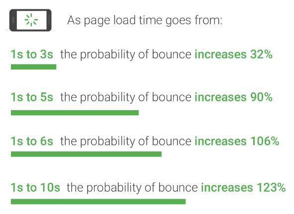
✓ 90% of bounce rates are attributed to low speeds.
✓ Consumers are more demanding - from 1-3 seconds you're ok, but for every two seconds after that the possibility of a user navigating away from your site triples!
Does responsive design mean giving up creative control?
In this day and age of multi-device compliance, performance often trumps beauty, but many developers don't feel comfortable sacrificing aesthetics for improved performance.
Marketers are beginning to put ads on faster sites, while consumers are now moving away from sites that don't offer mobile solutions and those that take too long to access. Developers feel arm-twisted into compliance.
✓ If site owners don't comply and improve speed, chances are Google will pile on pressure by introducing and adapting algorithm that requires speedy updates, forcing site owners into submission.
✓ 70% of the world's online users are on 3G or slower network capability, which means that web design is not as much a matter of capacity, as it is a matter of design simplicity.
With these factors in mind, there will perhaps be the need to sacrifice a bit of aesthetics to achieve break-neck speed. This, however, does not mean that creative control needs to be collateral damage. There are ways around this problem.
How to improve your mobile responsive design
There are some steps you can take to maximise a responsive design for your mobile site without necessarily sacrificing creative control.
✓ Mobile optimization
Up to 50% of all online activity is actually mobile traffic. This means that without a mobile-friendly website, or even an exclusive mobile site, you are missing out on a substantial amount of business.
Fonts, resolutions, and navigation systems should all be set on a platform that is accessible to 3G networks and below. Yes, aesthetics are important but so is emphasising and optimising user experience.
✓ Optimize visuals
The best way to optimise an image is by reducing the size of the file. This can be done without reducing the quality of the image. There are resources that will come in handy, such as TinyPNG or Compressor.io. Here you may be able to substantially reduce the image size, even as much as 80%, and still maintain quality.
You can also optimise videos by compressing the time factor or converting the files into FLV or MP4 keyframe. This will reduce the size and the load-time.
✓ Javascript/CSS solutions
Most people don't realise that there are tons of irrelevant characters typed into Javascript code. With the right kind of resource, it is possible to make changes that can reduce file sizes by up to 50%. Removing anything from unnecessary characters to white spaces actually goes a long way in as far as improving page speed is concerned.
✓ Streamline backlinks/redirects
It is also crucial to ensure you don't have too many redirect links. For instance, each link should give direct access to the target page. Too many bounce sites cause confusion, especially for mobile sites. Minimising the number of domain names will decrease the complexity of your site and ultimately contribute to quicker load-time.
Responsive design doesn't have to sacrifice form for function
In essence, the best user experience platform begins with page speed - clear and simple. Investing more in speed and easy navigation is a crucial way to ensure you increase your dwell time and reduce overall bounce rate.
But remember: ensuring performance optimisation doesn't mean that you have to settle for a website that looks second-rate. Take a look at EuroDNS's Core Shared and Advanced Web Hosting plans, equipped with SitePad website builder, a responsive design solution that provides everything you need to build a fast-loading site that looks great on any mobile device.
Author Bio
SerpBook is an SEO rank tracking and reporting tool. Duncan Kingori is a member of SERPBook's team of content writers. He has written extensively on marketing-related subjects.
Data privacy under Australia’s Assistance and Access Bill 2018
Related articles: