5 Stunning WordPress Homepages to Boost Conversions
Imagine yourself trying to sell a house with an overgrown garden, cracked driveway, and a broken front door. No buyers, right? The same thing might happen while improving your website. But don't worry! We have prepared 5 brilliant ideas for you. Check out these WordPress home page examples and get inspired!
As the most widely used content management system in the world, WordPress is the backbone of countless stunning homepages that combine creativity and functionality.
Get ready to explore 5 brilliant WordPress homepages that will inspire your next website makeover and drive more conversions!
1) A minimalist WordPress homepage example
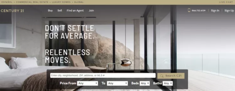
Century 21’s WordPress homepage is a masterclass in cozy minimalism. It's a perfect example of how WordPress makes creating a clean, minimalist design easy. Its its clean layout and the consistent color palette, everything feels polished and inviting. This shows how focusing on simplicity can make your homepage stand out.
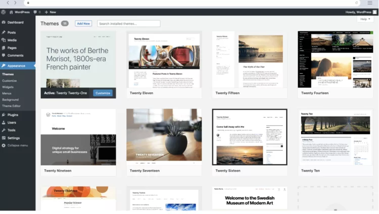
If you’re new to WordPress, our simple guide to using WordPress CMS is the perfect place to start building your site.
2) Seasonal design inspiration
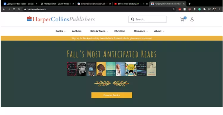
HarperCollins’ homepage takes a seasonal spin with its fall-themed design. The golden yellows and deep greens, sprinkled with tiny leaf accents, feel like a warm invitation to autumn.
It’s a clever way to keep visitors hooked - after all, who wouldn’t stop to explore a site that feels this inviting? Maybe it’s time to think about how a touch of seasonal flair could give your homepage that extra charm too.
3) Homepage with product highlights
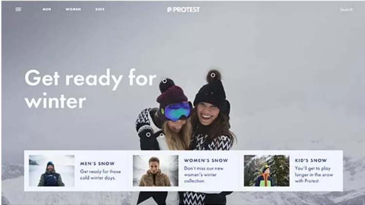
Protest, a sportswear brand from the Netherlands, keeps its homepage all about the product. Each season gets its spotlight, making it easy for visitors to find what they need right away. No distractions—just clear, focused design that puts the products front and center.
It’s a great reminder that sometimes, less storytelling and more showcasing can be the winning move for your homepage. If your homepage needs to showcase data or visuals more effectively, consider using data visualisation plugins to create engaging and interactive elements.
4) Visually appealing design
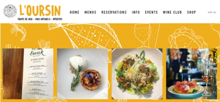
L’Oursin, a charming Seattle restaurant, knows how to make a homepage visually irresistible. With mouthwatering food photos and warm yellow accents, it’s hard not to imagine yourself sitting down for a meal.
The clean layout and well-placed navigation buttons make it effortless for visitors to explore - because who wants to struggle to find the menu when their appetite is already piqued?
5) Representing the website’s main idea
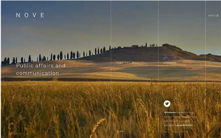
Nove’s homepage proves that sometimes visuals speak louder than words. With its fullscreen video background, transparent menus, and tailored page templates, it instantly conveys the essence of the brand. It’s a bold reminder that a strong design can tell your story before visitors even start reading.
What makes a homepage stand out?
Now that you’ve seen what makes these homepages stand out, it’s time to think about your own. What little tweaks or bold changes could transform your homepage into a high-converting masterpiece?
Let’s break it down:
Practical tips for your website
1. Start with a logo that sticks
A recognisable logo is like your site’s handshake - it’s the first thing visitors notice. Whether you design one yourself or hire help, make sure it aligns with your homepage’s overall vibe.
2. Experiment with seasonal themes
A touch of seasonal flair or holiday offers can keep your website feeling fresh and relevant. Think fall-inspired colors, winter snowflakes, or even spring blooms.
3. Focus on details
From your core theme to your color palette, every element should work together to create an inviting aesthetic. Don’t underestimate how much these small touches matter.
From your core theme to your color palette, every element should work together to create an inviting aesthetic. To enhance your homepage further, consider adding essential plugins that improve functionality and user experience.
4. Keep navigation simple
A clear menu bar and easy-to-find buttons can make all the difference. Visitors want to find what they’re looking for fast, so prioritize usability over complexity.
5. Test, tweak, repeat
Don’t be afraid to try new ideas, whether it’s moving a button, updating images, or rewriting content. Tools like SE Ranking can help you catch errors and track what’s working.
Every great homepage starts with a simple idea - so start small, test often, and build your way to a design that truly converts.
Always check your website using website audit tools like SE Ranking to make sure there are no errors.
Conclusion
Every great homepage starts with a simple idea - so start small, test often, and build your way to a design that truly converts. Developing essential WordPress skills can help you take your designs to the next level while boosting your career.
Take these tips, add your own unique spin, and create a homepage that feels just as inviting as the examples we’ve explored. After all, your homepage is the face of your website - make sure it’s one that visitors won’t forget.
Corporate Domain Management : Best Practice Guide
Lifteurop on their tool to monitor lifting systems
Related articles: