Top design mistakes in small business websites

Small businesses need high-converting websites to succeed. Avoid these common mistakes when setting up your website: an overload of internal links, sloppy CTAs, an unresponsive site, and visual clutter.
A high-converting website optimizes your marketing dollar and improves the financial health of your business.
After all, it’s on the business website where leads turn into customers.
To be successful, you need to avoid the common website mistakes small businesses make. Here are those mistakes:
Overload of Internal Links
Out of all the most common mistakes, this is probably on top of the list. The problem with overloading your site with internal links is that it dilutes your website and makes it lose structure. The result is poor user experience. Let me explain.
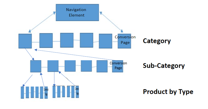
The Google algorithm uses your internal linking to understand the structure of your website. By doing this, they can understand which pages are the main pages and which are their subordinates. Understanding this structure makes it easy for the search engine to send the user directly to a page that answers their question.
Overloading your pages with internal links results in your website traffic being sent to a generic page when your business appears in search results. For visitors, generic results are frustrating and a waste of time.
As a business owner, you should ensure you have the right linking structure so that your target audience finds precisely what they want.
But what exactly is the right linking structure?

Your website should clearly follow a logical flow, as in the example above. To ensure a proper internal linking structure, consider the following, too, as your guiding principles:
Create a lot of content - Having a lot of content on your page eliminates the need to cramp all the links in a few pages.
Use anchor text wisely - The text you use to link to another page should clearly describe what the reader will find on that page.
Link deep - Avoid having too many links pointing to your homepage. Instead, link to dedicated pages that carry the bulk of the content on your site.
Use natural links - When linking, ensure that the links are in places where it seems natural for the reader to click the link and get more information.
Your internal linking structure is critical to the functioning of your site. Internal linking should improve the user experience, not complicate it.
Sloppy CTAs
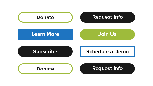
Sloppy CTAs are among the most common mistakes of small business websites. A sloppy CTA does not move the website visitor to take action. You don’t want that because the whole point of having a website is for the website to convert and generate revenue.
Your CTAs must be optimized correctly to generate as many clicks as possible. That means you should avoid a wordy CTA. The CTA should not be used to explain. It should only be used to command action. All the explaining should be done within the webpage. You should use language that’s inclusive for your customers on your website, just as you should use inclusive writing for your internal communications to employees.

From the example above, the CTA isn’t clear. When you ask your website user to do many things, they get overwhelmed and eventually leave. That’s the necessary consequence of overchoice.
On the other hand, if you simplify your CTA and write it in a few words that are clear and concise, your ideal customer is more likely to take action.

The CTAs shown above are examples of clear and concise CTAs.
To determine the best CTA for your SMB website, you should A/B test your CTAs. Start with one that you think would do well, then change one element and study how the CTA performance changes. Keep tweaking different components of the CTA until you find the one that works best for your website.
You can even use these tested CTAs for your email marketing. Just use an email address finder before you send your emails to ensure your marketing emails reach the intended people and ultimately elicit action.
Lacking a Mobile-Friendly Website
Also on the list of common mistakes of small business establishments is not creating a mobile-friendly website. Mobile traffic has surpassed desktop traffic. As a result, you might be forgoing the bulk of your potential traffic if you do not have a mobile-friendly website.

When your website users have a positive interaction with your business on their mobile phones, they are more likely to make a purchase and even recommend your company to someone else.

A mobile-friendly website needs to be responsive. Ultimately, it has to resize depending on the screen size so that all the elements on the desktop site are still visible from a smaller screen. Take the example of this website of a local eatery in Sarasota, Florida. Here’s the website opened using a desktop.

Here’s the website when accessed using a mobile phone.

Notice that everything on the small screen is still readable. You can use the Google Mobile-Friendly Test to determine if your site is mobile-friendly.
Visual Clutter
When you have too many visuals on your site, your website does nothing for your business. People want to understand what a website is about as soon as they get to it. They can’t do that if there’s a lot of visual clutter. The result is that they’re likely to leave.

Ivory and Deene is an excellent example of a website that knows how to use visuals on its website. There’s only one main picture on the homepage. One glance at the page, and you know that Ivory and Deene is a home decor website.
You must make your business website as decluttered as possible.
Ensure your SMB’s website is clear, clean, and well organised. Have a clear focal point on your website. All the other visuals on your site should complement the focal point. Having a decluttered website also allows for the CTA to stand out. That increases the chances of your website visitors taking action.
In closing
Today, whether or not to have a website for your small business is not even a debate. On top of your outstanding business idea, a website should be part of your business plan, marketing budget, and business model.
But don’t just create a business website without thinking it through. Avoid the common mistakes for small business websites. Ensure that your website follows a logical internal linking structure. In addition to good copy, you should have an engaging CTA and a decluttered page. Furthermore, your website should be mobile-friendly.
By steering clear of these mistakes, your SMB website will be among your most potent business tools. A high-performing website is a solid business decision.
Authors Bio
Owen Baker is a content marketer for Voila Norbert, an online email verification tool. He has spent most of the last decade working online for a range of marketing companies. When he’s not busy writing, you can find him in the kitchen mastering new dishes.
How To Buy A Domain: 2025 Ultimate Guide
Related articles:
